PROJECT
Logo Design and Brand development
Client
Cubbie
Solution
We helped define Cubbie’s mission to empower children and young people by ensuring equal access to education, placing their units in as many educational settings as possible. The new logo and accompanying brand elements not only reflect this mission but also introduce a fresh, vibrant look and feel. The logo visually represents how Cubbie supports children in transitioning from overwhelm and dysregulation to a place of calm and regulation, capturing both the essence and dynamic energy of the brand.
The logo brings to life how Cubbie achieves this; surrounding children and transporting them from overwhelm and dysregulation, to a calm and regulated place.
About the logo
The Cubbie logo features the essence of Cubbie in several ways.
The Wordmark
Uses Gilroy, a bold, clean and inclusive typeface made up of smooth curves and sharp angles. The Cubbie touch is added by curving the ‘i’ to create a visual representation of the Cubbie user.
The Icon
Create an encapsulating outer wall, that is filled with the fluid form, representing the user
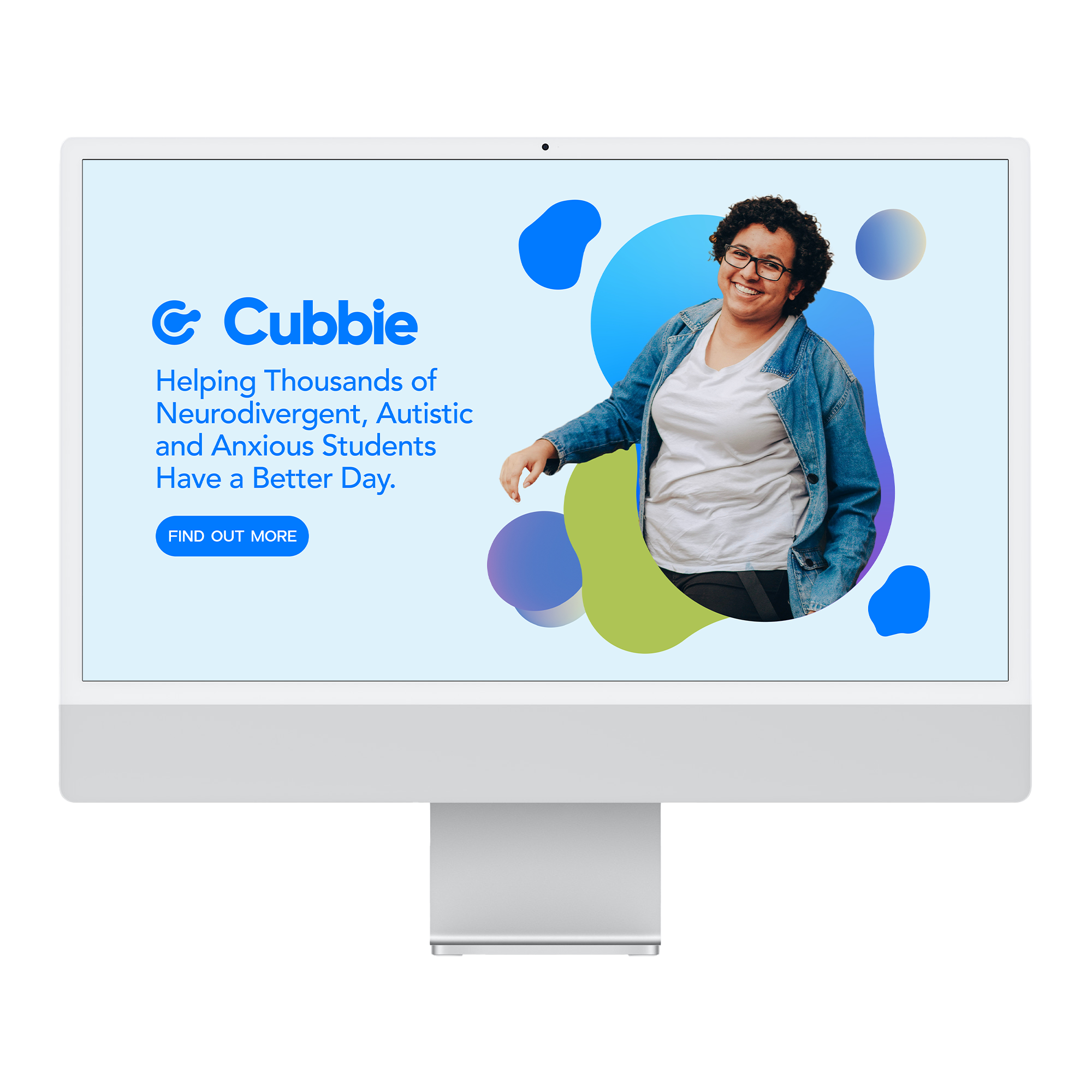





Cubbie Cube Wraps
The Cubbie is wrapped in one of three unique graphical montages. This transforms Cubbie from the rigid, often cold medical space, to an inviting, warm space where anyone in need of sensory regulation can find solitude and rest bite from outside triggers.


