PROJECT
The Future is ND Brand Development
Client
The Future is ND
The Brief
Revitalize the brand to ensure it translates seamlessly across various platforms, enhances accessibility, and retains its core essence and tone of voice.
Solution
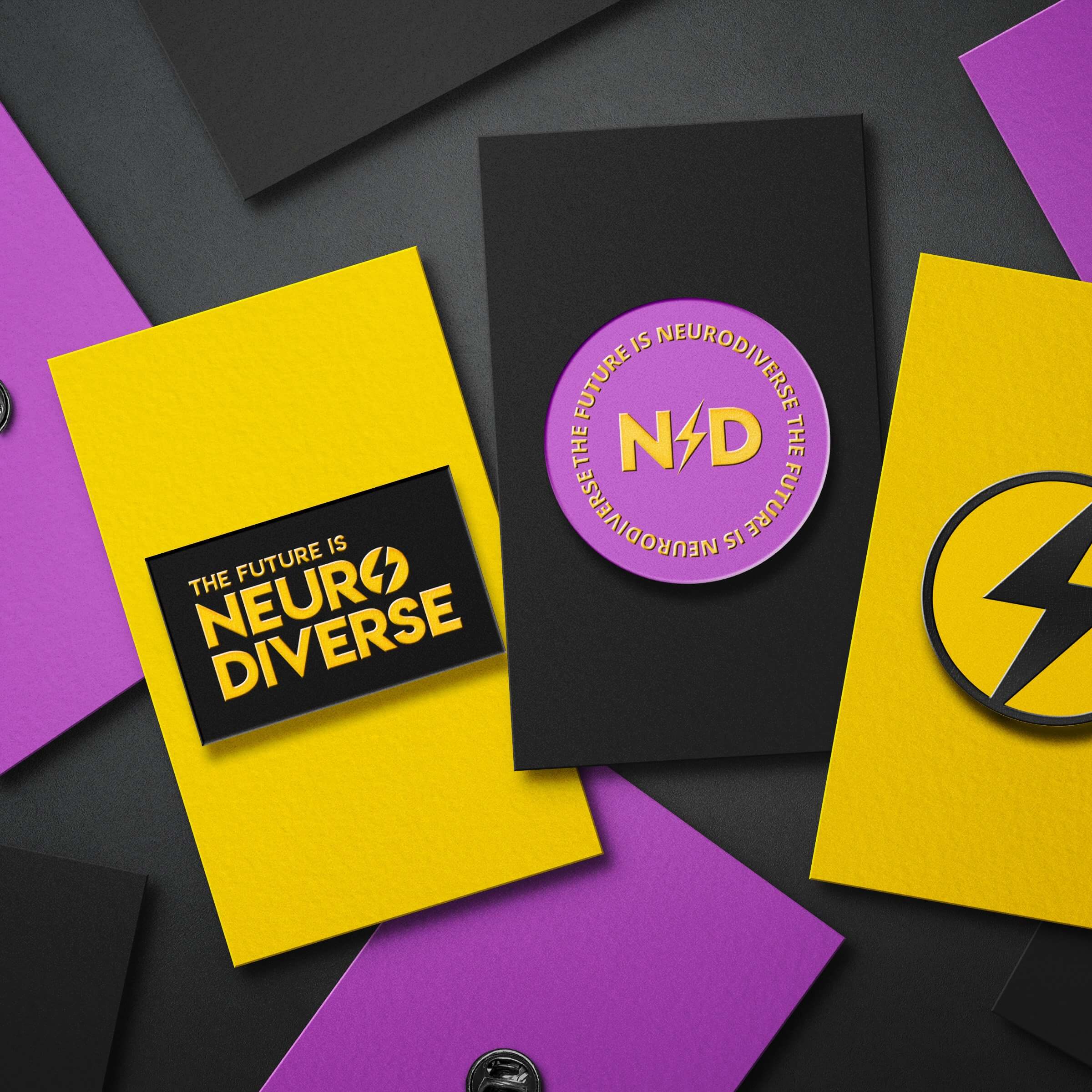
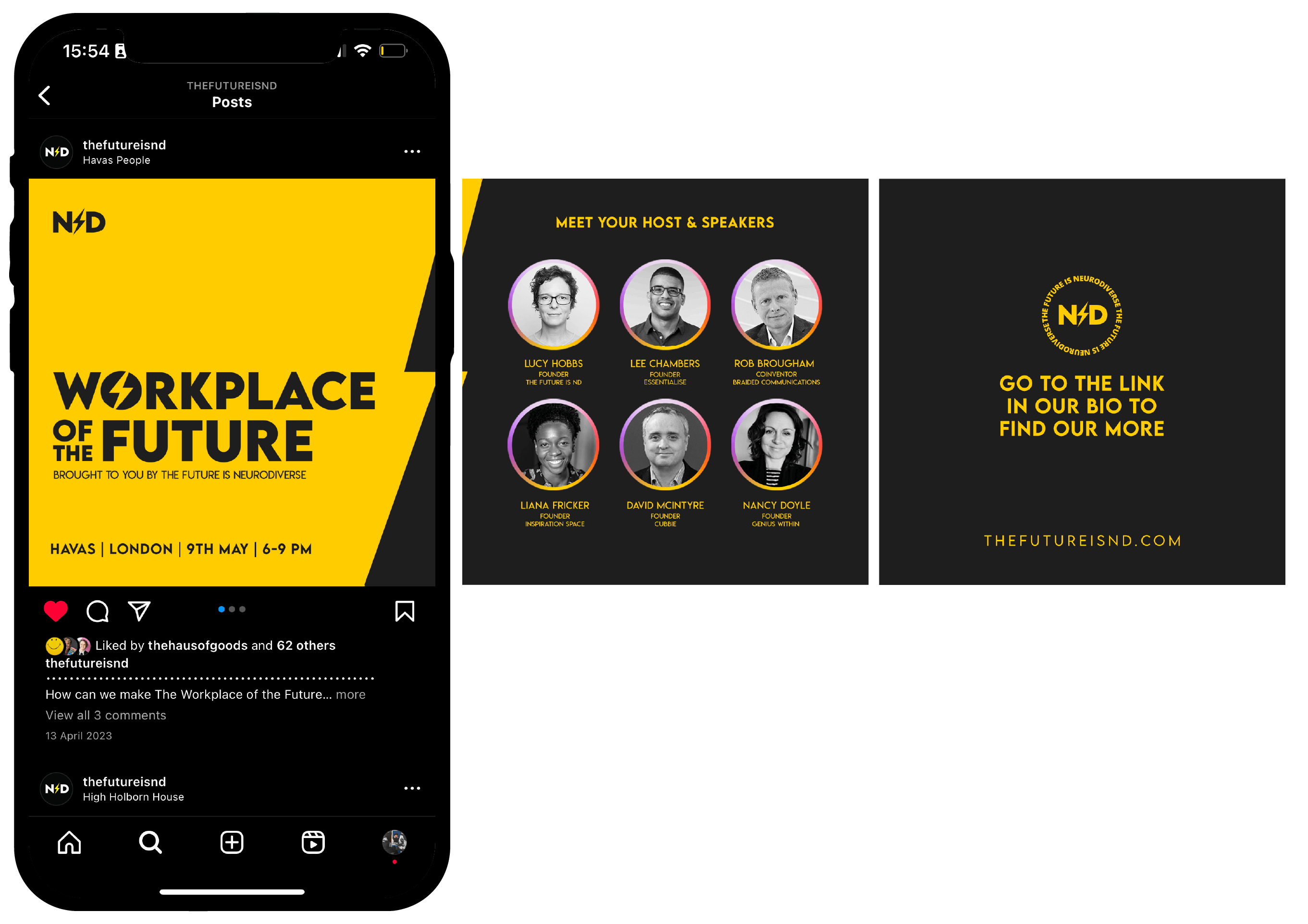
A versatile toolkit of standout brand elements paired with a refreshed colour palette, designed for consistency and maximum accessibility across all applications.
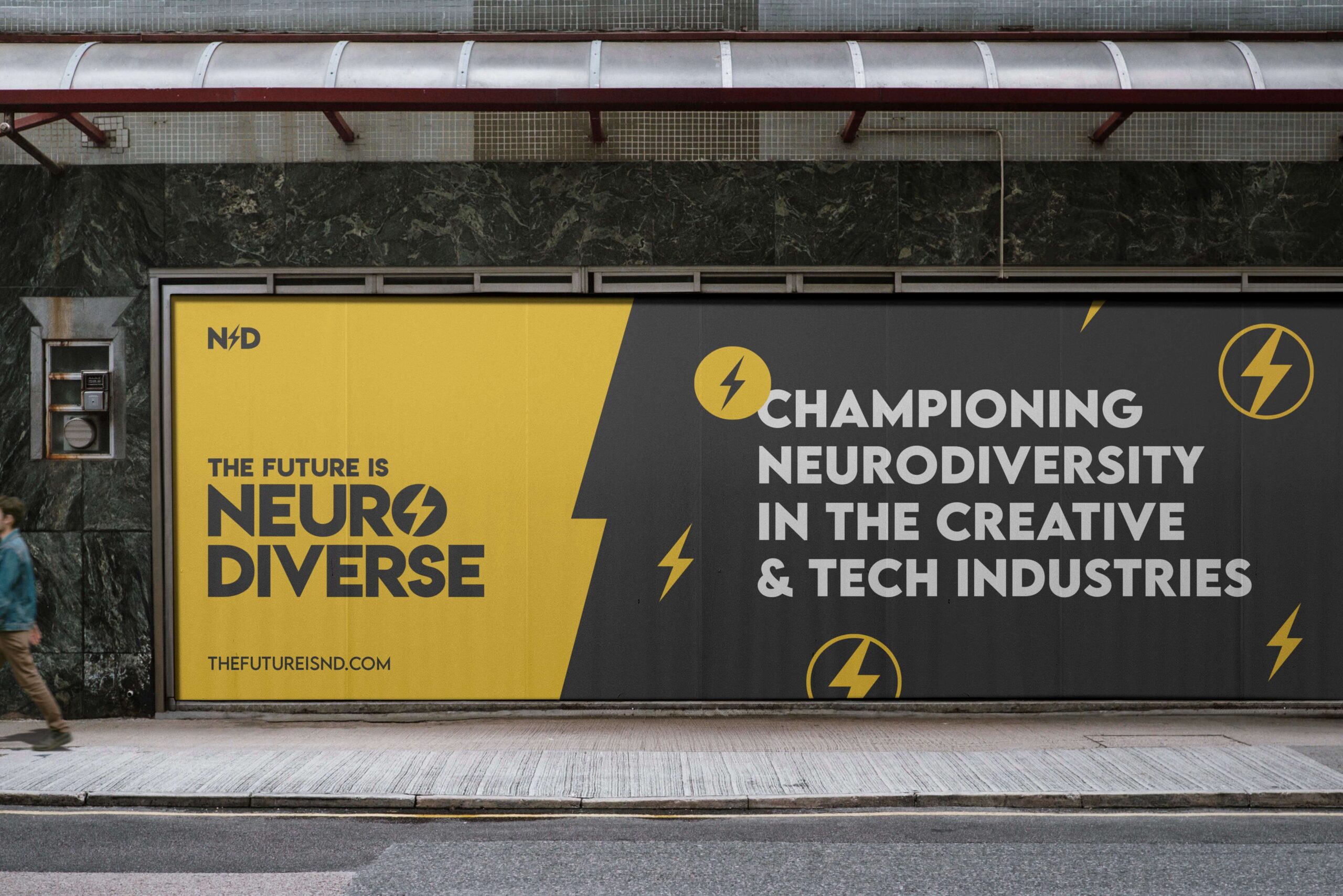
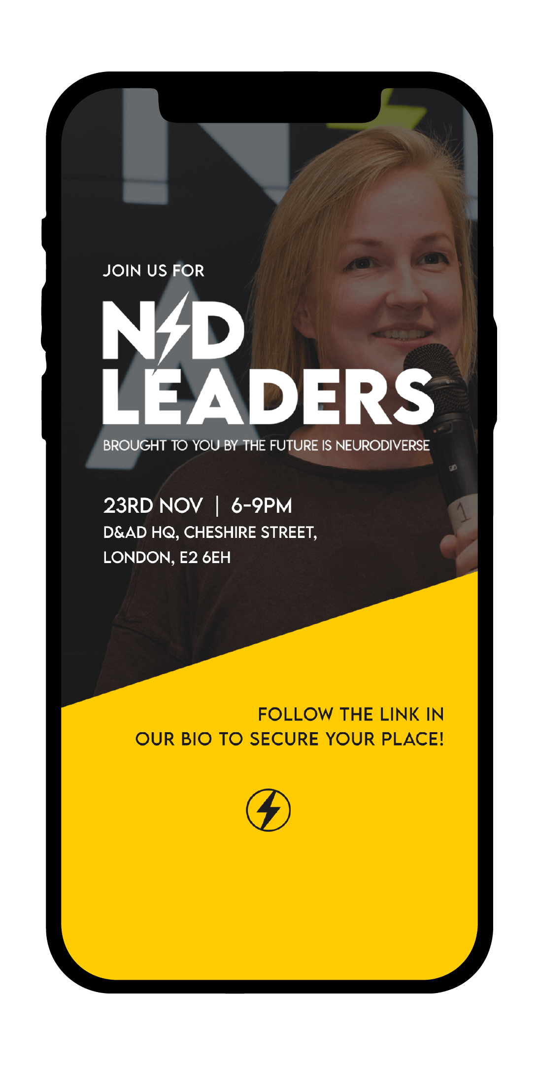
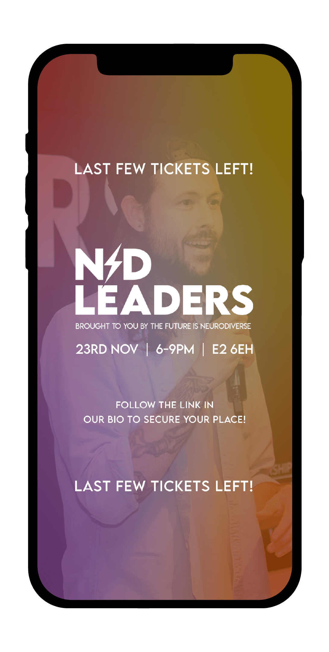
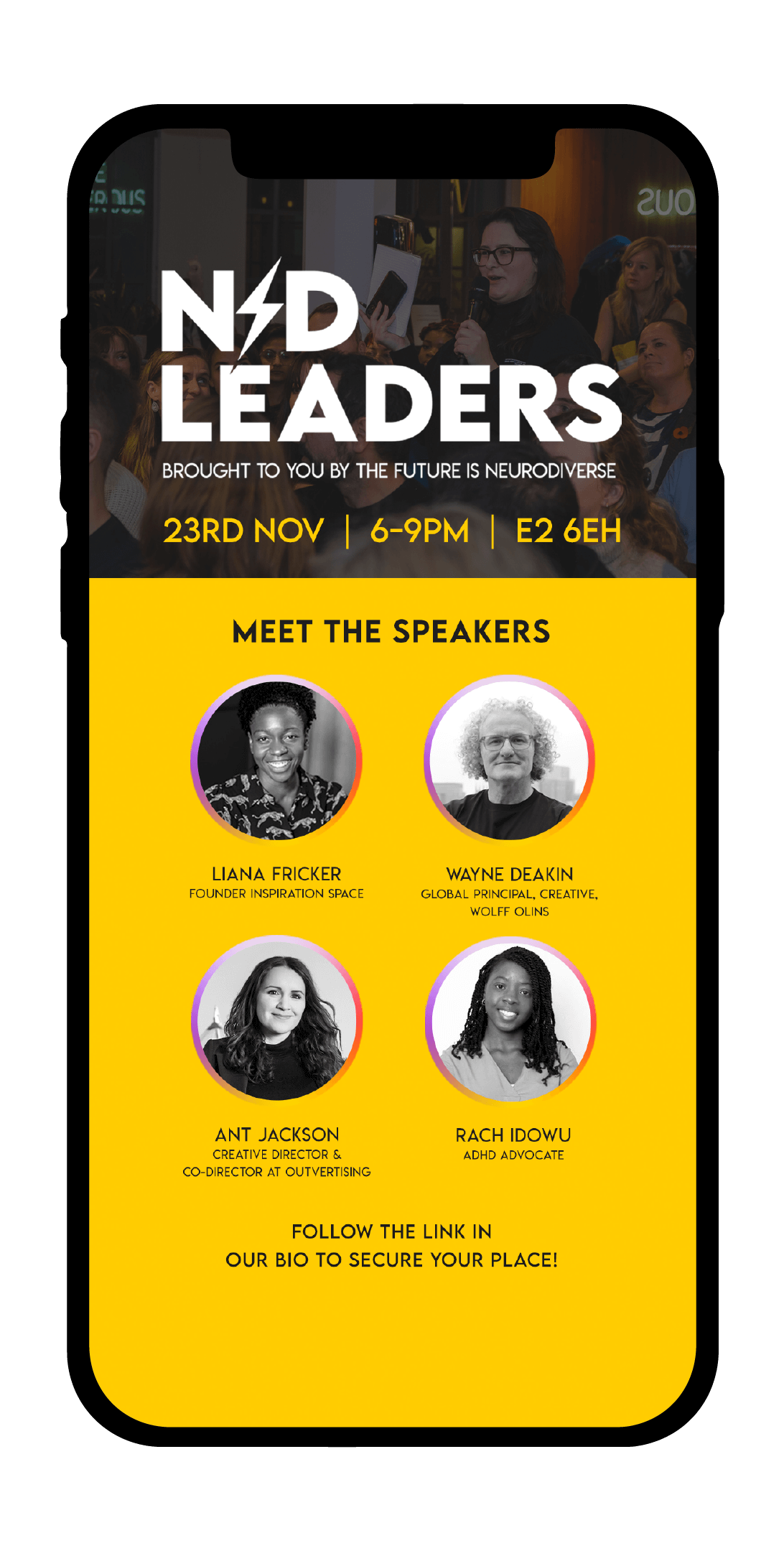
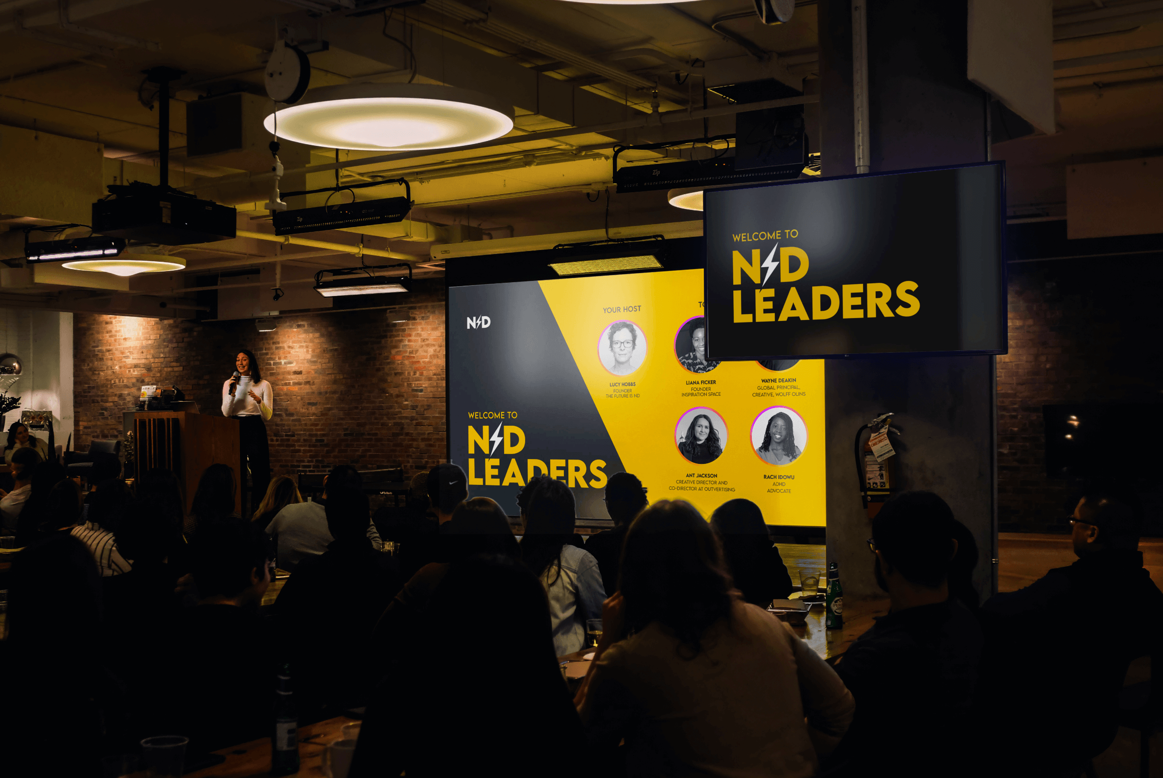
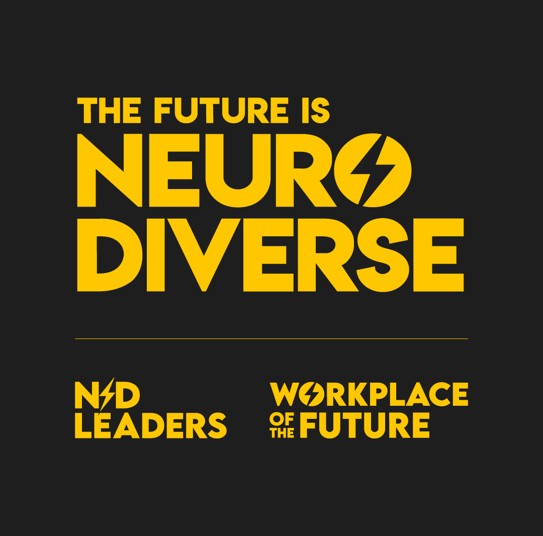
Type Treatments
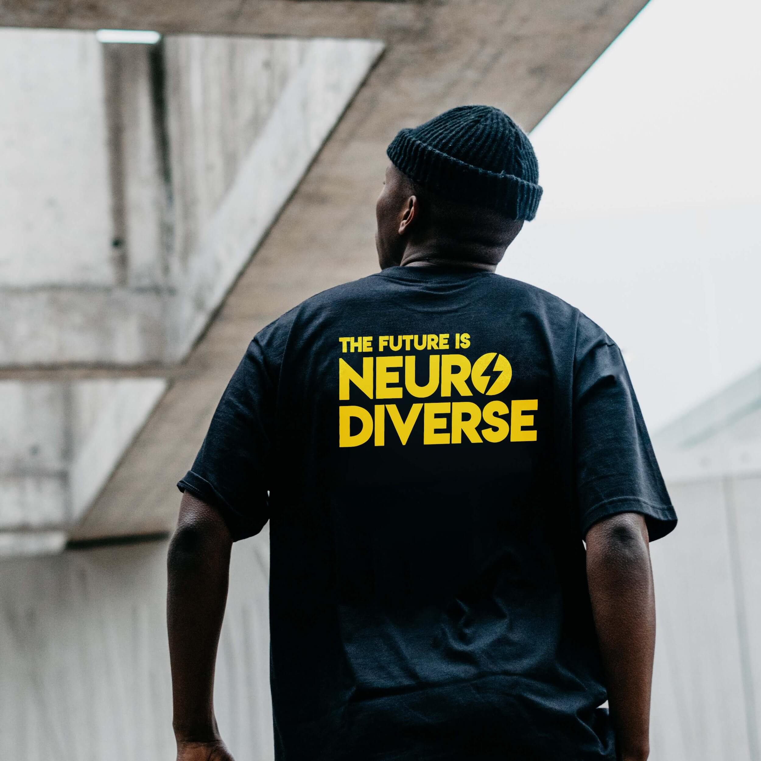
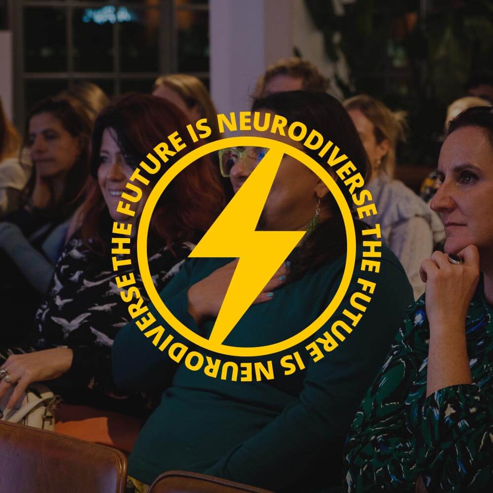
The type treatment for The Future is Neurodiverse is bold and instantly recognisable through two key elements:
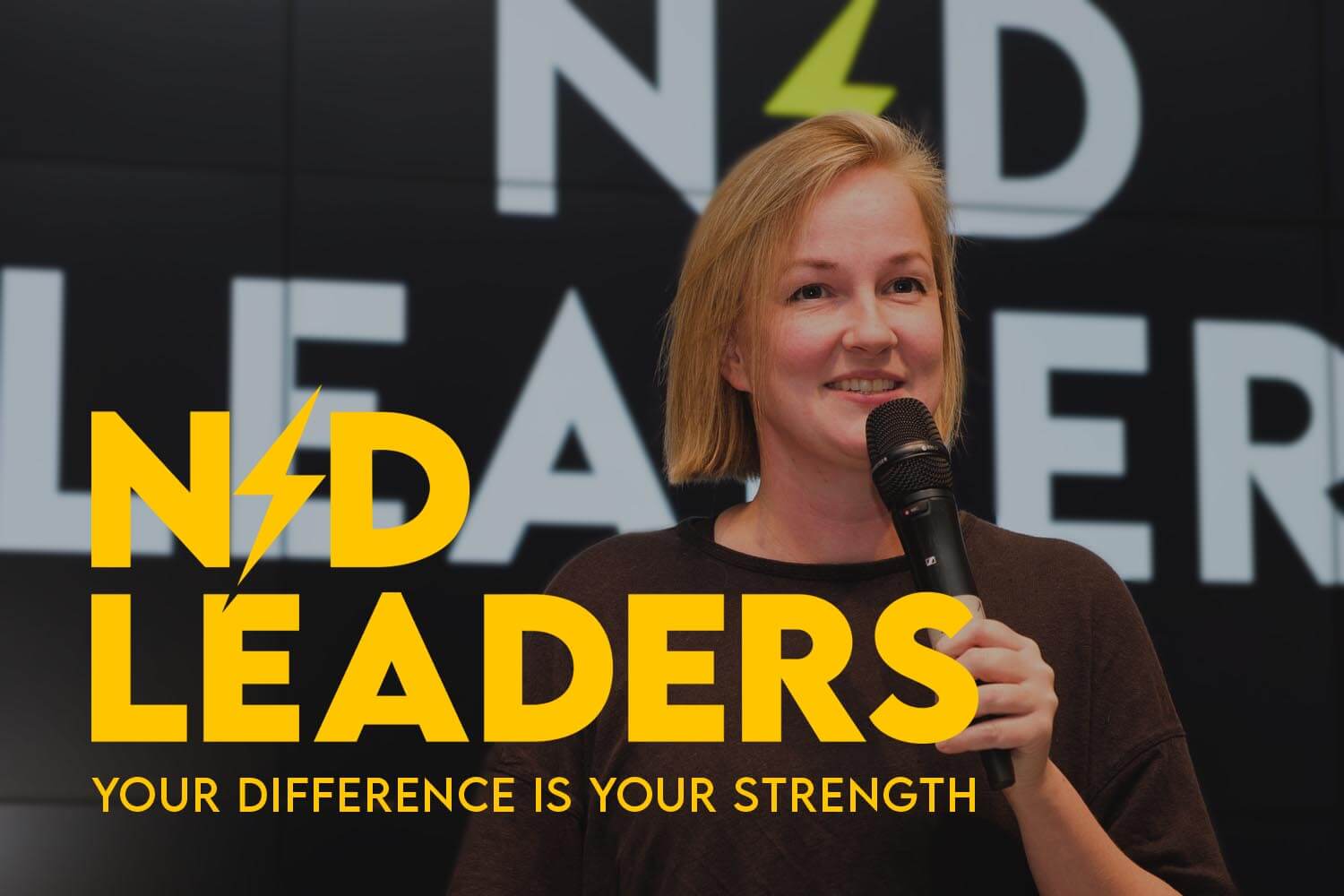
- Lightning Bolt Icon: The lightning bolt, placed strategically within the text, replaces specific letters (such as “O” in “NEURODIVERSE” and as a separator in “N⚡D LEADERS”). This not only gives the text a unique visual flair but also symbolises energy, innovation, and forward-thinking—qualities central to TFiND’s mission.
- Lemon Milk Font: The Lemon Milk font is bold, clean, and modern, conveying confidence and strength. Its geometric shapes and solid letterforms make the text highly legible and impactful, reinforcing the brand’s commitment to inclusivity and clarity.
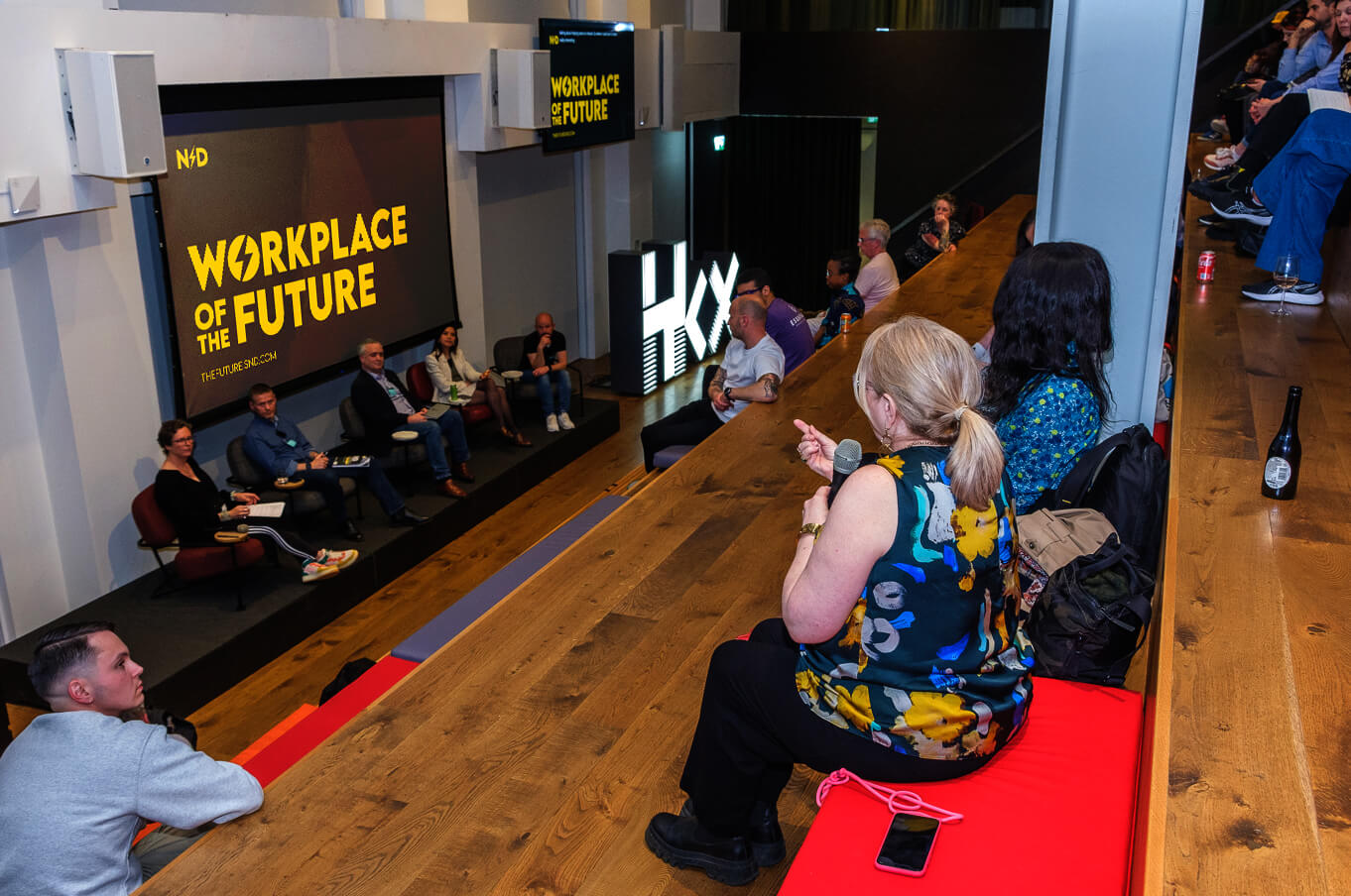
Together, these elements ensure that TFiND’s wordmarks are cohesive and memorable, suitable for various brand touchpoints—be it digital platforms, physical signage, or promotional materials—while consistently conveying the brand’s energetic and inclusive ethos.
"I designed the original logo in about 10 minutes without much thought for where it would need to go apart from on socials. It was a basic concept, and not working for all contexts, especially the website. I needed a good designer to help me develop it further. Jason got the essence of the brand from day one and has been a dream to work with, and continue to work with as the brand continues to develop"
— Lucy Hobbs, Found of The Future is ND
